Switch
The switch field shows an on/off switch for you to enable/disable something. You can choose a style (rounded or square) and set custom text/icon labels.
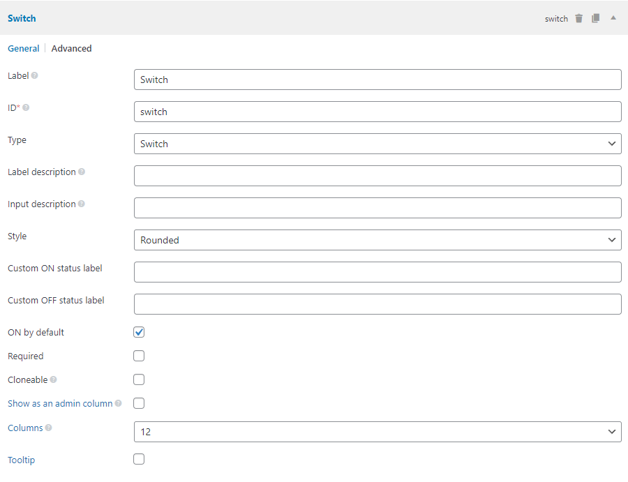
Screenshots

Settings
Besides the common settings, this field has the following specific settings, the keys are for use with code:
| Name | Key | Description |
|---|---|---|
| Style | style | The switch style. rounded (default) or square. |
| Custom ON status label | on_label | The label for "On" status. Can be any HTML. You can set the text "Enable" or a check icon like <i class="dashicons dashicons-yes"></i>. When this setting is set to empty string, it displays a style like iOS switch. |
| Custom OFF status label | off_label | Similar to the above but for the "Off" status. |
This is a sample field settings array when creating this field with code:
[
    'id'        => 'enable_slider',
    'name'      => 'Enable Slider?',
    'type'      => 'switch',
    'style'     => 'rounded',
    'on_label'  => 'Yes',
    'off_label' => 'No',
],
Data
This field saves the "on" and "off" status in the database as "1" or "0".
Template usage
Conditional check:
$value = rwmb_meta( 'my_field_id' );
if ( $value ) {
    echo 'Checked';
} else {
    echo 'Unchecked';
}
Displaying "On/Off":
rwmb_the_value( 'my_field_id' );